Add peak list rectangles to a raw plot
add_peaklist_rect.RdAdd peak list rectangles to a raw plot
add_peaklist_rect(
  plt,
  peaklist,
  color_by = NULL,
  col_prefix = "",
  pdata = NULL,
  palette = P40
)
Arguments
- plt
The output of
plot()when applied to a GCIMSSample- peaklist
A data frame with at least the columns:
dt_min_ms,dt_max_ms,rt_min_s,rt_max_sand optionally additional columns (e.g. the column given tocolor_by)- color_by
A character with a column name of
peaklist. Used to color the border of the added rectangles- col_prefix
After clustering, besides
dt_min_ms, we also have- pdata
A phenotype data data frame, with a SampleID column to be merged into peaklist so color_by can specify a phenotype
freesize_dt_min_ms. Usecol_prefix = "freesize_"to plot thefreesizeversion- palette
A character vector with color names to use drawing the rectangles. Use
NULLto letggplot2set the defaults.
Value
The given plt with rectangles showing the ROIs and crosses showing the apexes
Details
If peaklist includes dt_apex_ms and rt_apex_s a cross will be plotted on the peak apex.
Examples
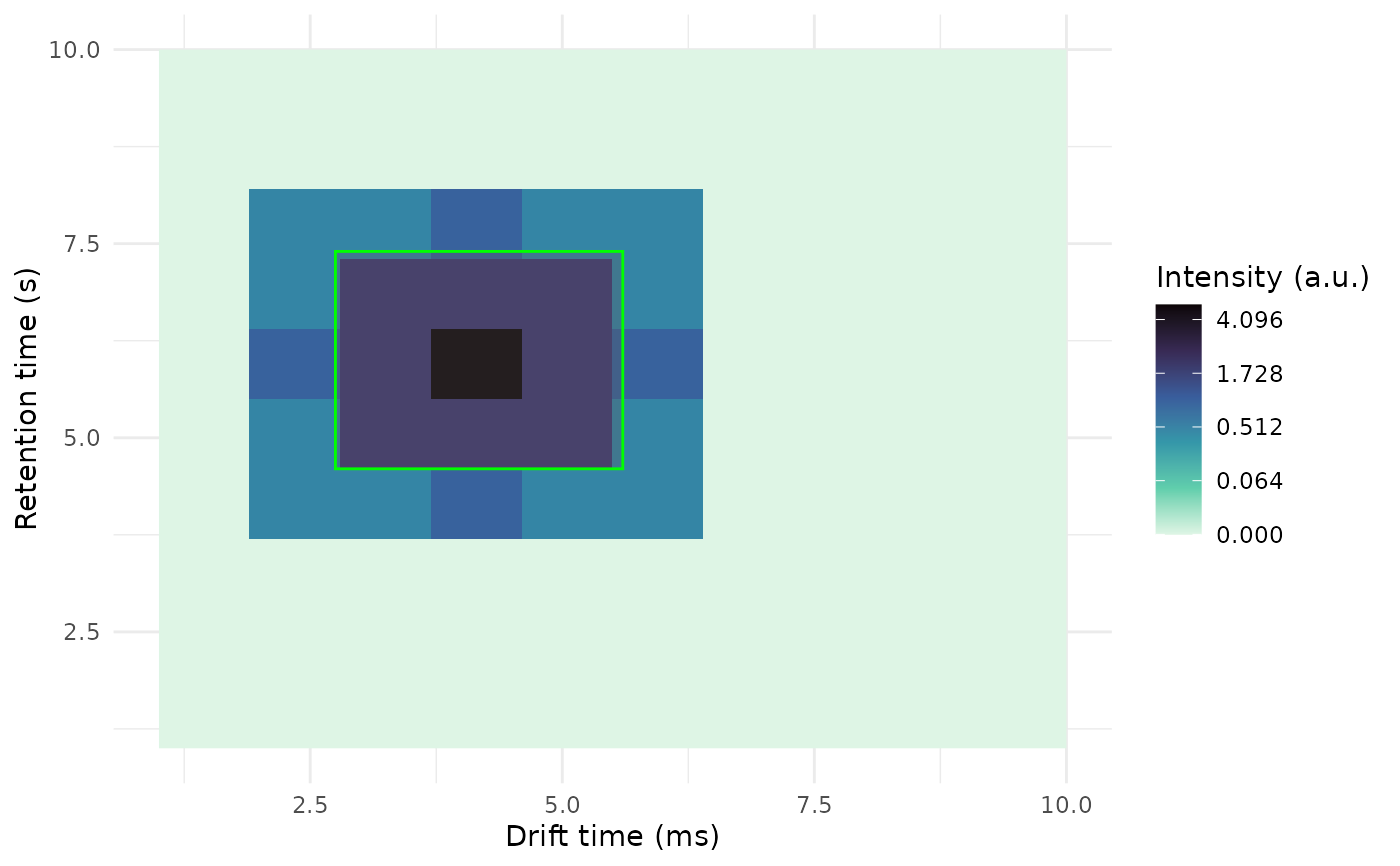
dt <- 1:10
rt <- 1:10
int <- matrix(0.0, nrow = length(dt), ncol = length(rt))

int[2, 4:8] <- c(.5, .5, 1, .5, 0.5)
int[3, 4:8] <- c(0.5, 2, 2, 2, 0.5)
int[4, 4:8] <- c(1, 2, 5, 2, 1)
int[5, 4:8] <- c(0.5, 2, 2, 2, 0.5)
int[6, 4:8] <- c(.5, .5, 1, .5, 0.5)

dummy_obj <-GCIMSSample(
  drift_time = dt,
  retention_time = rt,
  data = int
)
plt <- plot(dummy_obj)

# Add a rectangle on top of the plot
rect <- data.frame(
  dt_min_ms = 2.75,
  dt_max_ms = 5.6,
  rt_min_s = 4.6,
  rt_max_s = 7.4
)

add_peaklist_rect(
  plt = plt,
  peaklist = rect
)
#> Warning: `add_peaklist_rect` is deprecated
#> ℹ Replace `add_peaklist_rect(plt, peaklist)` with `plt +
#>   overlay_peaklist(peaklist)` instead